Physical Address
304 North Cardinal St.
Dorchester Center, MA 02124


Trying anything new in life can be a massive step out of our comfort zones, even if it’s just taking up a new hobby, like pursuing coloring as an adult. For some people, what helps them get started better and feel more confident in something they don’t have prior experience in is getting familiar with some advanced concepts and techniques. If you’ve been feeling the same way, then we suggest familiarizing yourself with color theory and implementing it in your coloring.
Color theory is essentially about discovering harmony and an optimal combination of colors so that results come off really well. Say you’re taking up coloring as a passion project or a class and don’t want the results of your coloring to look childish, or maybe you want to really stand out. In such a case, it’s safe to say that color theory is a really good way to build your ability for coloring and start off strong. We’re going to outline all the major dimensions of color theory and how you can use each when filling up your adult coloring books.
Color theory basically teaches us that every color we put into our body of work should complement and connect to the other. This tells us that the base colors we pick out and around which the rest of our color choices will be based need to be really thought about. Putting on ourselves the pressure of knowing and picking the right colors can be exhausting. This is why color theory has a mechanism to it.
Colors are split into primary, secondary, and tertiary categories based on whether they exist as a combination of other colors or solely on their own. Consulting a color wheel can help you figure out which colors are which by virtue of their placement. There are a variety of color wheels, so sticking to one that is best suited to coloring, even the Traditional Color Wheel that works well for painting, are both prudent choices. Try picking a color that goes well with the other hues you have in mind for the coloring figure you’re picking.
While choosing to experiment and be daring when coloring your adult coloring temporarily sounds like a brilliant idea, color theory urges us to have a more systematic approach. Color combinations mean serious business because they’ll end up determining whether the colors go well with one another or end up either washing one another out or being too opposing to look good together. The color theory brands these combinations as color schemes.
Color schemes come in a large variety, from complementary and monochromatic to analogous and triadic. Each of these schemes has its own strength and work because they depict a spectrum of colors that go together to create a visually appealing look. This will take the pressure off of you to make sure that you can accurately tell which colors work with which. This will put the fun back in coloring and allow you to pursue the hobby from a better perspective.
Going wild with your colors, even if they’re picked from a well-curated color scheme, is still a bad idea. There is still the matter of saturation, contrast, deeper shading, and focal points. All of these need to follow a particular balance to come out just right. According to color theory, these decisions are based on whether the color is primary, secondary, or tertiary. Primary colors are always picked for the base since these are what essentially capture the attention of the onlooker. These need the most saturation and, in this way, become the focal point of the figure.
Secondary and tertiary colors follow along in terms of saturation and depth. Allowing this difference of saturation within your colors will create a progression that will help the scheme sit better and make the entire thing look visually satisfying. Respecting the dictations of the color theory in terms of saturation and the category of colors will make your coloring experience interesting and fun. You’ll feel satisfied and motivated to delve deeper into the art of coloring.
Contrast is a very important part of the color theory; in fact, it can sometimes very well be the thing that brings your coloring to life and gives it some much-needed edge. When there is an appropriate difference in the selection of colors you’ve picked out, the interest of viewers will be piqued. Color theory provides a quite simple template for orchestrating the optimal kind of contrast in coloring. Firstly, either light and dark or warm and cool aspects of contrast should be picked out.
Following this, the highest level of contrast should reside in the focal part of a figure and progressively lessen moving away from it. This makes contrast the element that makes your coloring attractive. It’s always important to follow the principles of the color theory when delivering the right kind of contrast. Otherwise, the mush and mash of colors can sometimes become painful and unsettling for viewers. Instead of taking risks, stick to what’s known to work with the color theory.
Color theory places so much accentuation on the placement and combination of colors because it operates according to the belief that each color has something to give. Depending on whether they’re warm or cool-toned, colors can make viewers feel different kinds of feelings. So, according to that, it’s important to look at what pages you’re choosing to fill on your adult coloring book and whether your choices of color align well with the depictions.
Warmer tones stimulate feelings of passion, energy, aggression, excitement, and the like. In comparison, cooler color tones are more about serenity, calmness, gloominess, and so on. Suppose your choices of color don’t go with the figure. In that case, this can result in a mismatched reaction from onlookers because their brains can’t really process the opposing thoughts and feelings that are being communicated from the colors in contrast to the depiction. Let your adult coloring book masterpieces receive the praise they deserve by picking the right tones!

Now that you’re mostly familiar with the major teachings of the color theory, it might seem a little risky to simply try out color placements on your coloring book the right way. This kind of thinking is not at all unjustified but quite clever! A good way to familiarize yourself and experiment with the right kind of color patterns is to attempt swatches or mix those colors on other surfaces before you move the party to your adult coloring book.
The matter stands that some pencil colors or other supplies like crayons that are used to fill out adult coloring books might look different than they appear to be by their packaging. This is why it’s wise to try them out before and figure out which colors they can make the best combinations with. Swatching colors is also a great way to familiarize yourself with different colors, understand your preferences, and what generally calls to you when coloring in your adult coloring book.
Color theory is a great hack for making smart color choices when choosing to fill up a coloring book page, but there are other things that you need to keep in mind as well. It’s important to incorporate better coloring techniques alongside your color theory choices. Methods like blending and shading are simple ways to depict different textures and effects through colors. These are guaranteed ways to make your adult coloring book stand out.
Color choices are very important, hence why abiding by color theory rules brings such obvious results. But to really take things to the next level, experimenting with color techniques is essential, too. If you’re someone who gets a lot of motivation by performing and continuously learning, then taking up new and more advanced techniques as you try incorporating color theory in your coloring endeavors is a really great way to make things interesting.

Sure, color theory is about following a very steady blueprint, but sometimes, we’re just too uninspired to make the right color scheme choices, and nothing seems to click. To really turn your adult coloring book into a masterpiece of colors through color theory, take a look at the works of art around you. Among all else, nature truly is the best manifestation of color theory. The perfect balance between colors, just the right contrasts, and the flawless blending of colors into one another is a live example of the color theory in action.
Simple everyday sights like the sky, sunsets, plants, and all kinds of scenery can inspire you more than anything else. Attempt to replicate the aspects of the color theory that you see in these contexts and see just how miraculous the color depictions on your coloring book end up coming out. If you’re unsure about how well certain colors might go together, if you see them work nicely in any landscape, then they’re good to go on paper, too!
While color theory is an excellent way to get yourself into the world of coloring and rev yourself up to attain the best results, it’s not always an immediate process. Color theory requires a depth and understanding of colors that often come with time, experience, and lots of inspiration. Joining the right community, seeking help from those who have a penchant for colors, and, above all, staying true and committed to the process.
More times than not, simply sticking to coloring will enhance your perception of colors and help you develop an understanding of their underlying relationship. With time, you’ll find yourself looking at color wheels less and knowing the major aspects of the color theory at your fingertips. Experience can eventually help you translate the theoretical depictions of color theory into action. Soon enough, you’ll be coloring in your adult coloring books like a real pro.
The color theory sounds a little rigid at times, but since it is rooted in art, it in no way discourages people from experimentation and errors. Often, the best results with colors and art come out of attempts that are as unplanned and as unhinged as possible. Sometimes, you can look at the color theory as inspiration for something better. So, don’t be afraid of incorporating the principles of the color theory as you take up coloring as an adult for fear that it is too complicated and you won’t be able to keep up with it.
Color theory can help you build the confidence to take good risks with your coloring and work on them to unleash great creativity while also maintaining the balance and harmony of colors. Coloring can be really fun and indulging when you have somewhat of a blueprint to fall back on. In this way, experimentation is not too risky as to cost you the visual aesthetic of your coloring book, but still open enough to allow you to experiment yourself and find new aspects of your preferences as related to coloring. This can be especially rewarding when you pursue coloring as an adult.
Adult coloring books and filling them can be more fun and rewarding when done in alignment and with an understanding of the color theory. This theoretical body is a great way to guide color choices, the selection of base colors, contrasts, and saturations. Putting some good coloring techniques in the mix is also a great way to take your coloring endeavors to another dimension.
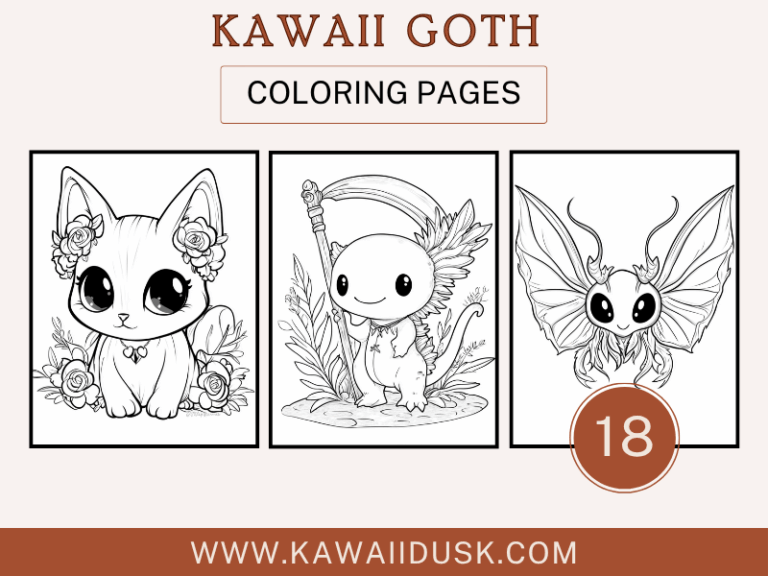
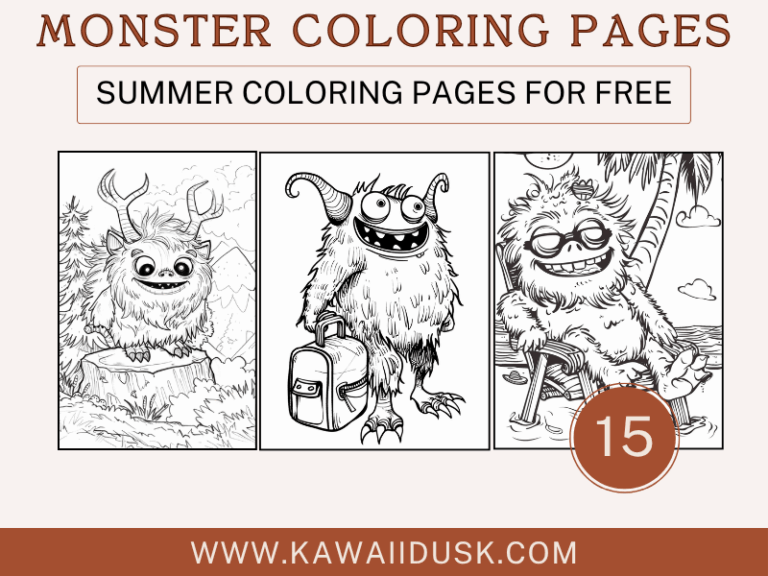
Make sure you pick out the best adult coloring books to unleash your color theory methodologies onto. KawaiiDusk has an excellent selection that helps you pick out the right kind of coloring book that calls to you and helps you implement the best coloring techniques.