Physical Address
304 North Cardinal St.
Dorchester Center, MA 02124

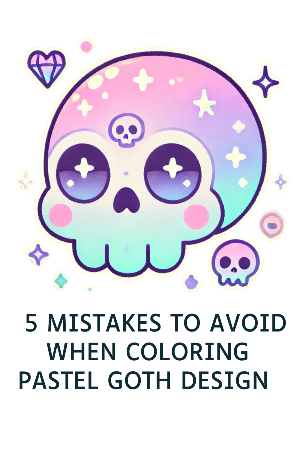
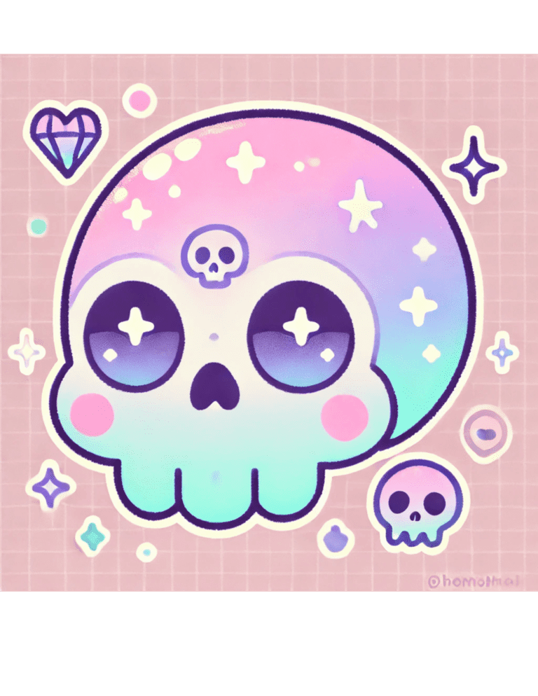
Coloring pastel goth designs is an exciting way to blend soft pastels with dark, edgy elements like skulls, bats, and crosses. It’s a mix of sweet and spooky—a perfect pairing for those who love aesthetic contrasts! But while coloring these designs can be so much fun, there are a few common mistakes that can throw off your final masterpiece.
Don’t worry, though! I’m here to guide you through the top 5 mistakes to avoid when coloring pastel goth designs so your work can look bold, balanced, and beautiful.
Pastel goth is all about a balance of light pastel tones and deep, dark shades like black, gray, or dark purple. If you use too many different colors, it can clash and make the design feel chaotic instead of cohesive.
Stick to a limited color palette of 3–5 colors. For example, you can pair soft pink, mint green, and lavender with black and gray for a classic pastel goth look. This creates harmony and makes your design pop without feeling overwhelming.
Plan your palette before you start coloring. Swatch your chosen colors on a scrap piece of paper to see how they look together.
Pastel goth designs rely on contrast to stand out. If you use only light pastel colors without adding darker tones, your design can feel flat and lack the signature edgy vibe of the style.
Always balance your pastels with darker shades. For example, if you’re coloring a pastel pink bat, outline it with black or shade the wings with dark purple. This contrast makes the design pop and gives it that moody pastel goth energy.
Use black strategically! Add it to details like borders, outlines, or small accents to make the lighter colors shine.

Pastel goth designs often have intricate details, and a busy background can distract from the main subject. If the background is too detailed or uses too many colors, it can overwhelm the entire piece.
Keep the background simple and subtle. Use soft gradients, single colors, or minimal patterns like faint stars or stripes to complement the design without competing with it.
Pastel gray, lavender, or a light wash of mint green can make a great background base. You can also leave some areas white for a clean, balanced look.
Without highlights, pastel goth designs can look flat or dull. Highlights bring dimension and shine to your work, making it look polished and professional.
Add small highlights to key areas, like the edges of a skull, the eyes of a bat, or the surface of a pastel potion bottle. You can use a white gel pen, a light-colored pencil, or even a bit of erasing to create these effects.
Think about where the light source is coming from when adding highlights. This will make your design feel more realistic and dynamic.
It’s easy to slip into just pastel or just goth while coloring, but the magic of pastel goth is in the mix of both! Forgetting this balance can result in designs that feel too cutesy or too dark, missing the charm of the aesthetic.
How to Avoid It:
Keep the aesthetic in mind as you color. If you notice your design is leaning too pastel, add dark accents like black stars or crosses. If it’s looking too dark, brighten it up with pastel pink hearts or lavender sparkles.
Pastel goth thrives on contrast. Pair sweet motifs (bows, moons, candy) with edgy ones (spikes, skulls, webs) to strike the perfect balance.

Pastel goth coloring is all about having fun with contrasts—soft vs. dark, sweet vs. spooky. By avoiding these common mistakes, you can create stunning designs that showcase the unique beauty of this aesthetic. Remember to plan your palette, balance your contrast, and keep the pastel goth vibe alive in every detail.
Try coloring a design using these tips and see the difference it makes! If you’re looking for free pastel goth coloring pages, check out my collection here on Kawaii Dusk.


